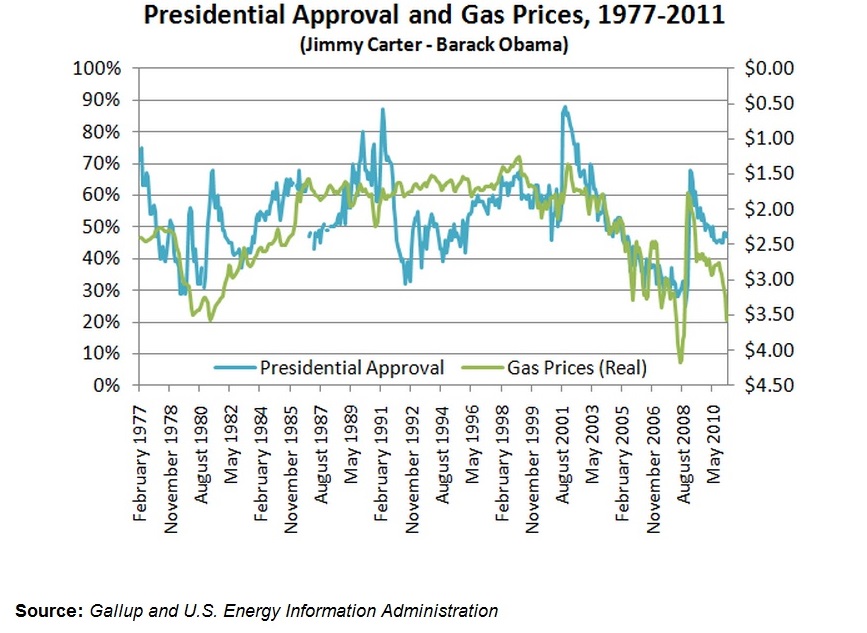
Mr. President is back in the nation’s good graces. Can his approval rating be tied solely to prices at the pump? This chart- with approval ratings from Gallup, over gas prices from the US Energy Information Administration, shows a strong correlation between the two data points. Be wary that the gas price axis, on the right, graphs higher prices towards the bottom. As prices rise, approval of the nation’s leaders decreases. Surely the true causality is complicated, but the correlation is too strong not to notice a pattern. Citizens have historically felt more favorable to the oval office when they are spending less on gas.

February 2, 2015
